
Grabbing the shopper’s attention

Grocery stores need to grab your attention quickly in the store.
You have probably felt it when you’re at the store; that subtle pressure from special displays, eye-catching sale signs, and products strategically placed to catch your attention. It's not accidental. Grocery stores have mastered the art of influence. Grocery stores and the products they sell have mastered the art of attraction. They know what will draw the consumer’s attention: bright packaging colors, products placed at eye height, and store layout. These choices come from years of studying the psychology of how consumers behave to certain environments and situations that persuade the consumer. If you’ve ever watched Mad Men, you know how detailed the consumer is studied for marketing purposes.
Product placement and store layout
Product placement can have a big influence on buying trends
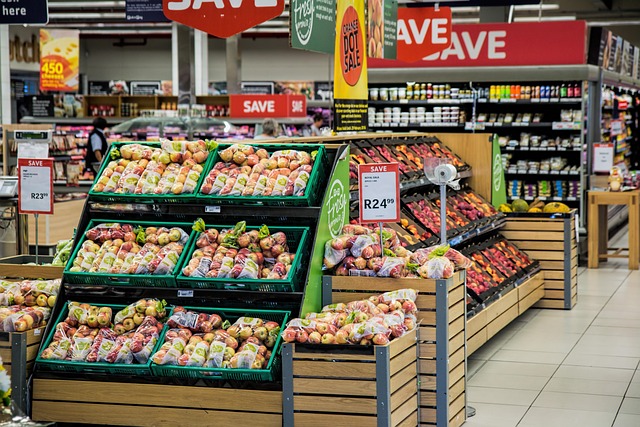
The perimeter loop has multiple purposes. Having the freshest items like meat and produce along the perimeter of the store allows easy up-keep and rotation of the perishable products. In addition, fresh produce at the entrance creates a healthy, abundant first impression that puts shoppers in a positive mindset and makes them feel virtuous, potentially loosening restraint for indulgent purchases later. Dairy and meat at the back forces shoppers to traverse the entire store for staples, maximizing exposure to impulse items. Center aisles are organized to maximize browsing time. Related items are sometimes separated intentionally—pasta sauce several aisles from pasta—to increase store exposure. Conversely, complementary items cluster near each other (chips near salsa, wine near cheese) to trigger combo purchases shoppers hadn't planned. "Natural" and "organic" sections create health halos that justify premium pricing, even when nutritional differences are marginal. Store brand positioning varies—Walmart's Great Value sits next to name brands for direct comparison, while Whole Foods' 365 occupies its own sections, framing it as a curated alternative rather than a budget option. The entire environment is engineered to extend shopping time, increase basket size, and shift purchases toward higher-margin items while maintaining the perception that shoppers are in control and getting value. It's fascinating how much research and iteration goes into what feels like simple shelf placement. Eye-level placement is premium real estate where the highest-margin items live. Products at adult eye level typically cost more than identical items on lower shelves. Children's cereals sit at kid eye level for direct appeal. The "end cap" displays at aisle ends command premiums from manufacturers because they're high-visibility spots that disrupt planned shopping patterns. Checkout lanes are psychological gauntlets designed to capture last-minute impulse purchases when decision fatigue is highest. Candy, magazines, and small indulgences surround captive audiences. The slowdown also allows time for shoppers to second-guess leaving without grabbing "just one more thing."
Sensory Manipulation: Designing the Shopping Experience

Playing with the senses can alter the experience of shopping
Grocery stores don't just rely on visual cues—they orchestrate a complete sensory experience designed to keep you shopping longer and buying more. Walk into almost any grocery store and you'll likely smell fresh-baked bread or cookies, even if the bakery is at the far end of the building. This isn't coincidence—it's strategic scent marketing. Bakery aromas near entrances aren't just a pleasant byproduct of in-store baking; they're deliberately circulated to trigger hunger and positive emotional associations. When you smell warm bread, your brain associates the store with comfort, home cooking, and abundance. You're also more likely to feel hungry, which studies show increases impulse purchases by 15-20% and encourages shoppers to buy more indulgent, higher-margin items. Some stores take this further with subtle scent diffusion throughout different departments. The floral section might have enhanced floral notes. The produce section gets hints of fresh citrus. These ambient scents work subconsciously to make each area feel fresh and appealing. Lighting design is equally calculated. Produce sections use specific color temperatures—typically warmer, slightly yellow-tinted lights—that make fruits and vegetables appear fresher, riper, and more vibrant. Tomatoes look redder, greens look crisper, and bananas seem sunnier under these carefully chosen bulbs. The lighting isn't just about visibility; it's about making products look their absolute best and encouraging you to buy more. Even the music playing overhead serves a purpose. Stores adjust tempo based on traffic patterns and business goals. Slower, more relaxed music (around 60-80 beats per minute) encourages leisurely browsing, which correlates with increased spending—shoppers move through the store more slowly, notice more products, and make more unplanned purchases. During peak times when stores need to move crowds efficiently, they switch to faster-paced music (100+ beats per minute) that subtly encourages quicker movement through aisles. Some retailers report that tempo adjustments alone can influence transaction sizes by 10-15%.
Shopping Cart Psychology: Bigger Is Better (for the Store)
Perspective is everything
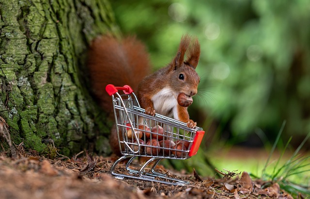
The humble shopping cart is a carefully engineered psychological tool, and it's been growing steadily over the decades for good reason—larger carts mean larger purchases. A cart that looks empty feels like it needs filling. Even when you've picked up everything on your list, that vast expanse of empty cart space creates subtle psychological pressure to add "just a few more things." Studies tracking shopping behavior show that shoppers using larger carts spend 20-40% more than those using smaller carts or baskets, even when they came to the store with identical shopping lists. This isn't accidental. Cart sizes have increased substantially since the 1970s, growing from around 3.5 cubic feet to over 7 cubic feet in many modern stores. That's double the volume, which means your normal weekly shopping haul now fills only half the cart—and that empty space whispers that you're forgetting something or missing out on stocking up. Store layout capitalizes on this psychology. The cart size is optimized for the aisle width and shelf height, creating a visual relationship that makes products seem more abundant and accessible. You're essentially piloting a vehicle designed to accumulate more than you planned to buy. Some stores now offer smaller carts or European-style baskets at secondary entrances, but these are often positioned subtly or in limited quantities. The default is always the oversized cart positioned prominently at the main entrance. Interestingly, stores noticed during the pandemic that shoppers using their own reusable bags or small baskets spent less per trip—so post-pandemic, there's been even more emphasis on encouraging full cart usage. The psychology extends to cart placement too. Ever notice how carts are always readily available at entrances but return corrals are strategically scarce inside the store? Once you've committed to pushing a cart, you're psychologically invested in using it, even if you originally came in for just two items.
Color Psychology: The Rainbow of Retail Influence
Color is very influential in framing what we see
Color is one of the most powerful and immediate ways stores communicate value, urgency, and quality—often bypassing your conscious reasoning entirely. Yellow sale tags are ubiquitous in grocery stores for a specific psychological reason: yellow grabs attention and is associated with optimism, energy, and alertness. It's one of the first colors the human eye notices in a busy visual field. When you see that bright yellow tag, your brain registers "something different here" before you've even read what the tag says. The color itself creates a sense of opportunity and urgency—this item is special, different from everything else on the shelf. Red clearance stickers and sale signs tap into even more primal responses. Red signals urgency, excitement, and action. It's the color of stop signs and warning lights, so it commands immediate attention. In retail, red communicates "act now"—whether it's a clearance deal, a limited-time offer, or a "manager's special." Studies show that red sale signage can increase product pickups by 30% or more compared to the same discount displayed in neutral colors. But color psychology goes deeper than sale tags. Look at the packaging itself. Products targeting health-conscious consumers lean heavily on greens and whites—colors associated with nature, purity, and freshness. Organic and "natural" products almost always feature earth tones, soft greens, and muted palettes that subconsciously communicate wholesomeness. Indulgent products use warmer, richer colors. Premium ice cream comes in deep burgundy o Premium ice cream comes in deep burgundy or gold-accented packaging. Chocolate products use rich browns and elegant blacks. Energy drinks and sports nutrition products favor aggressive reds, oranges, and electric blues that communicate intensity and performance. Even within the same product category, color signals quality tier. Store brands targeting budget shoppers often use simple, high-contrast designs with bold primary colors and clear fonts—communicating value and straightforwardness. Premium store brands (think Trader Joe's or Whole Foods 365) use more sophisticated color palettes with muted tones and upscale design elements that justify higher prices. Children's products are a masterclass in color psychology. Kid-targeted cereals, snacks, and yogurts burst with primary colors, cartoon characters, and high-contrast designs specifically engineered to catch children's eyes at their sight level. These packages practically vibrate with visual energy because they're designed to make kids say "I want that!" and create pester power that influences parent purchases.
Package Size Deception: The Shrinking Truth
Package sizes are shrinking
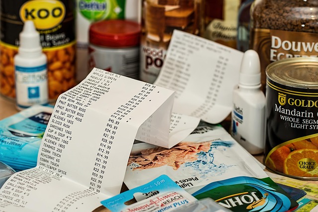
One of the more subtle psychological tactics in grocery stores involves making you think you're getting more than you actually are—or disguising the fact that you're getting less than you used to. Shrinkflation is the practice of reducing product size or quantity while keeping the price the same (or even increasing it slightly). Instead of raising the price of a box of crackers from $3.99 to $4.49—which would trigger immediate consumer backlash—manufacturers quietly reduce the contents from 16 ounces to 14 ounces while maintaining the $3.99 price point. The box looks virtually identical on the shelf, but you're actually paying more per ounce without realizing it. This has become increasingly common in recent years. Chip bags that once held 16 ounces now hold 13. Ice cream "pints" that were once truly 16 fluid ounces have shrunk to 14. Toilet paper rolls have fewer sheets. The changes are gradual enough that most shoppers don't notice unless they're paying close attention to unit pricing rather than package pricing (a Smopper classic!). Package design aids this deception. Manufacturers use clever structural changes to maintain the visual footprint while reducing actual content. A box might stay the same height and width but become slightly thinner. A jar might have a thicker base or a dimpled bottom that reduces capacity while maintaining external dimensions. Chip bags have always been mostly air, but that ratio has shifted even more in favor of air as actual chip quantity decreases. Oversized packaging works the opposite way but serves a similar psychological purpose. Ever bought a box of cookies or crackers only to open it and find a plastic tray half-filled with product and a lot of empty space? That's not accidental shipping damage—it's intentional design. The large box signals abundance and value on the shelf, encouraging you to purchase it over smaller-looking competitors, even when the actual quantity inside might be less. This is especially common in products marketed to kids or gift-giving occasions. Candy boxes, specialty snacks, and "variety packs" often feature impressive exterior packaging that creates expectations of generous portions, only to reveal modest quantities inside. The packaging has done its job by the time you're at the register—once you're home and opening it, the purchase is already complete. Multi-packs and "bonus size" claims also play into this psychology. A package labeled "25% MORE!" compared to the regular size sounds like an amazing deal. But unless you check the unit price, you might not realize that the "bonus" package actually costs more per ounce than buying two regular packages. The visual language of abundance and special offers overrides the mathematical reality. The opacity of packaging materials can hide these deceptions too. Cardboard boxes, foil bags, and opaque containers mean you can't see exactly how much product you're getting until after purchase. Manufacturers count on shoppers judging value by package size and shelf presence rather than carefully reading net weight and calculating unit costs.
Why This Matters for Smart Shoppers
All of these sensory and psychological tactics work together to create an environment where you're making purchasing decisions based on feelings, visual cues, and subconscious triggers rather than cold hard math and genuine need. The smell of bread, the color of a sale tag, the size of your cart, and the impressive dimensions of a package all conspire to increase your spending. Understanding these tactics is empowering, but actually countering them in real-time while navigating a busy store is challenging. This is where tools like Smopper become invaluable—by focusing on unit pricing, price history, and cross-store comparisons, Smopper cuts through the psychological noise and helps you make decisions based on actual value rather than engineered perception.